

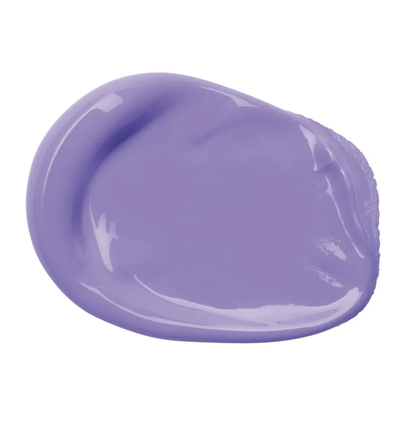
The Power of Purple
Understanding Purple: A Practical Guide to Painting with This Complex Color
Purple isn’t just a visually striking color — it’s one of the most interesting hues on the color wheel in terms of how it behaves in mixtures, how it affects composition, and how it interacts with light and shadow. In this post, we’ll break down the theory, mixing techniques, and practical applications of painting with purple to help you use it with confidence and intention. At the end, you can download a printable worksheet and practice using what you’ve learned (or been reminded of here today!)
🎨 What Is Purple in Color Theory?
Purple is a secondary color created by mixing red and blue, two primary colors. Because red is warm and blue is cool, purple sits between them on the color wheel — making it a transitional color. This position gives purple flexibility in harmonizing warm and cool color schemes, which makes it a valuable tool in painting.
There are two main types of purple:
Violet: More blue than red, leaning cool.
Magenta: More red than blue, leaning warm.
Artists often use the term purple to describe a whole range of hues from bluish-violet to reddish-mauve, even though in strict scientific terms, violet is a spectral color and purple is not.
🎨 How to Mix the Perfect Purple
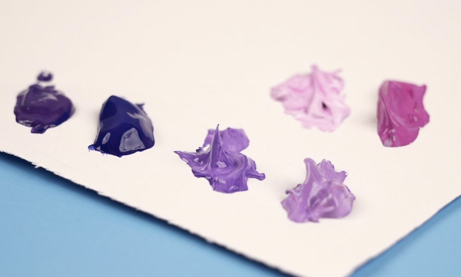
Mixing a vibrant, clean purple can be tricky, especially with student-grade paints. The key is understanding the bias of your primary colors. Here’s how to avoid muddy purples:
“Use Cool Reds and Cool Blues”
Best options:
Alizarin Crimson + Ultramarine Blue
Quinacridone Rose + Cobalt Blue
Permanent Magenta + Cerulean Blue
❌ Avoid Warm Reds or Yellows
Warm reds (like Cadmium Red) contain yellow, which is opposite purple on the color wheel. This causes a neutralizing effect and results in dull, grayish purples.
🌈 Temperature Tips
Add white to lighten and reveal undertones (lavenders, lilacs).
Add yellow or green to mute the color (useful for shadows or vintage effects).
Add black or burnt umber for deeper, more subdued purples (great for night scenes or underpainting).
🎨 Purple in Composition and Design
Purple has low natural occurrence in landscapes and real life, which makes it visually powerful. Use it wisely:
As a focal point: A well-placed purple subject or accent can draw the eye.
To create depth: Cool purples recede into the background, useful in atmospheric perspective.
To convey emotion: Purple evokes calm, mystery, spirituality, and melancholy depending on the shade.
🎨 Practical Uses for Purple in Painting
1.) Portraits
Use purple in skin tone shadows — particularly in cooler light. Mixed with brown or blue, it creates believable skin shadows that are less flat than using gray or black alone.
2.) Landscapes
Purple is ideal for distant mountains, shaded snow, and twilight skies. It also neutralizes green beautifully in forests and foliage.
3.) Still Life & Florals
Flowers like irises, violets, and lavender allow you to explore subtle purple variations. Pair purple with its complementary color (yellow) to make both pop.
🎨 Exercises to Practice Painting with Purple
Try these exercises to improve your understanding of purple:
Mixing Chart: Create a grid mixing different reds and blues from your palette to see the range of purples.
Monochrome Study: Paint a simple still life using only one purple, black, and white.
Complementary Challenge: Paint a yellow object on a purple background — observe how they interact visually.
Atmospheric Landscape: Use purple in shadow areas to explore depth and distance.
Final Thoughts
Painting with purple is a blend of technical understanding and creative intuition. Learn how it behaves with different pigments, explore its emotional range, and don’t shy away from using it in unexpected ways. The more you practice mixing and applying purple intentionally, the more control you’ll gain in your compositions.
Whether you're after vibrancy, subtlety, or symbolism, purple has the potential to elevate your artwork — if you let it.